Think about this - on average, visitors spend only 54 seconds on a web page. That's shorter than a TikTok video! 😮
But what if you catch their attention just as they're about to leave?
With the strategic use of exit-intent popups, you can entice them to linger longer.
These pop-ups are like a friendly salesperson who steps in with an attractive offer just as you're heading for the door. Let’s explore some awesome exit intent popup examples and how to create one for your e-commerce website.
Why We Love Exit Pop Ups?
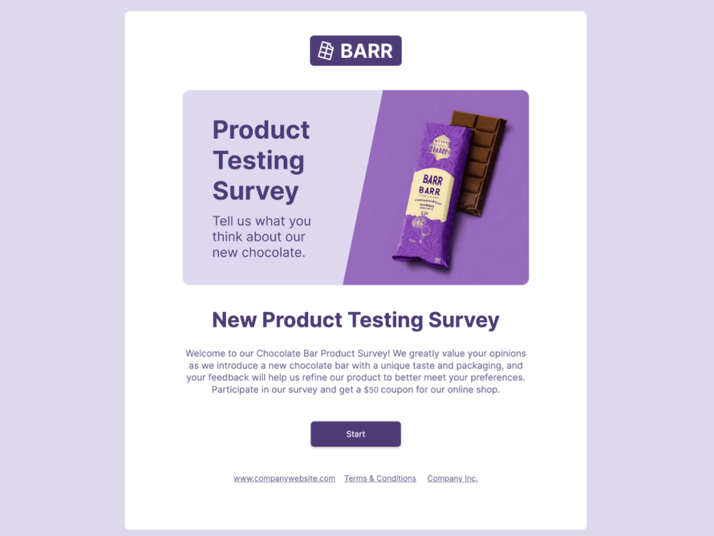
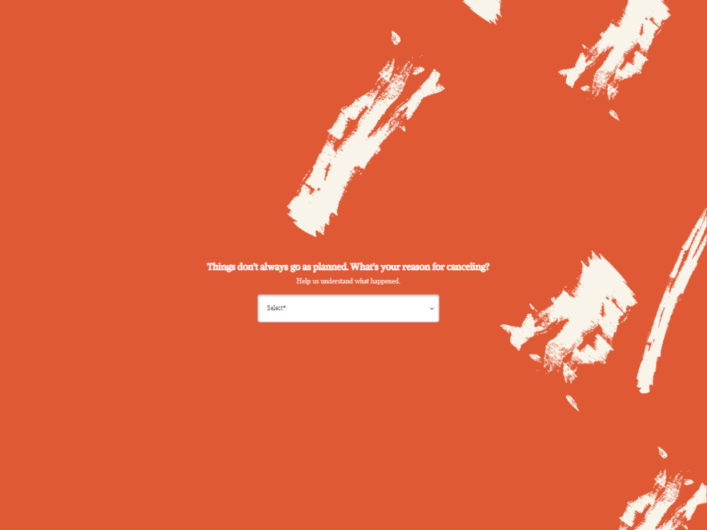
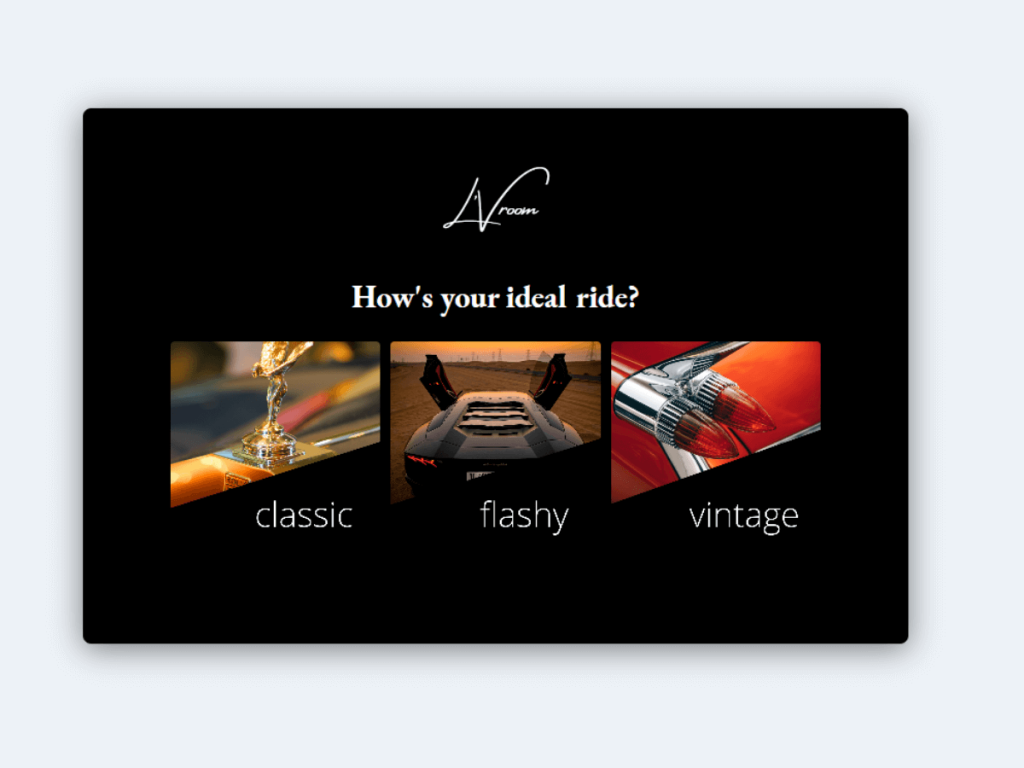
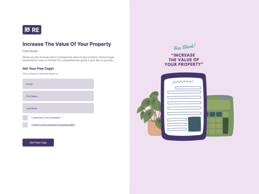
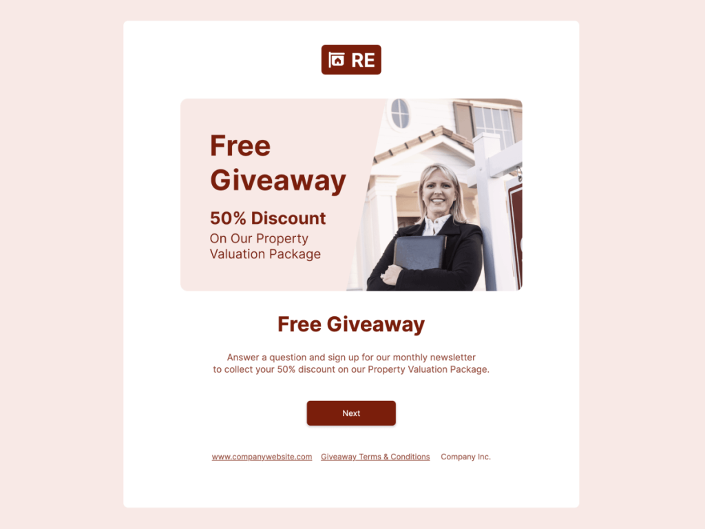
Take a sneak peek at the appearance of an exit pop-up:

Yes, I really love exit pop ups and here are my 3 reasons why!
Exit popups offer unexpected surprises like special offers, bringing the bounce rate down 🤩
They provide last-minute deals that users might not want to miss, like exclusive sales. 😎
And they're not clingy.🙄
How Exit Popups Can Help Your Ecommerce Business? (+Examples)
You might be wondering,
"Do these pop-ups really work?"
Absolutely, they do!
Study shows that around 10-15% of exiting random visitors on their way out actually respond to these popup messages, increasing the chances of conversion. So, let's discover how these popups can do wonders for your ecommerce business.
Expand Your Email List
The ecommerce space is crowded and competitive. Retaining existing loyal customers and keeping potential customers interested is crucial. Here, exit popups present a great opportunity to expand your email list by offering visitors a subscription popup in exchange for a valuable piece of content or a discount code. It can also be in the form of a blog newsletter subscription or relevant content downloads.
Organic Aromas, for instance, boosted their email signups by a staggering 150% through an exit-intent popup that offered a coupon code as an exit intent trigger. This is just one of the many exit popup examples that shows the effectiveness of understanding user behavior.
Pro tip: Your popups need to have social proof to convince your visitors to stay and opt-in.
For example, just when a visitor is about to leave Wisdom clothing website, an exit-intent popup appears asking for their email address in exchange for an exclusive opportunity to subscribe to their newsletter.

Also check out the example of CoSchedule. They successfully increased their email list by offering a free calendar in exchange for visitors' contact details.

Hootsuite also offers a compelling 60-day free trial through an exit-intent popup, acquiring visitors' email addresses in the process.

Getting Feedback Via Online Surveys
Understanding how visitors perceive your brand and website is essential. However, finding the opportune moment to request feedback can be a delicate balancing act.
If you ask too soon, users might not have enough experience to comment; ask too late, and they may have already left.
Exit intent pop ups appear just as the visitor is about to leave. It's the perfect moment. They've seen what you have to offer, and you're not interrupting their browsing. Now, it's like you're casually asking, "Hey, before you head off, would you mind telling us what you think about our site?" It's smooth, it's considerate, and it's an excellent way to gather audience insights. This data can help you to tailor your future digital marketing strategies and offers according to your target audience.
Take the example of Alibaba, the global e-commerce giant that uses exit-intent popups to ask visitors for their feedback:

Another example is Google Meet's Net Promoter Score (NPS) survey. After users have had a video call, and as they're exiting, a friendly popup asks, "How likely are you to recommend Google Meet?"
This way Google collects valuable insights at the right moment and continually refine their services based on real user experiences.

Create Your own Surveys
Get Started with 300+ Templates
Redirect Website Traffic
Exit-intent popups also serve as a second chance to pique the interest of your target users by guiding them to other relevant parts of your website.
Just as they're about to hit that 'x' button, your exit-intent popup shows up. It's like a friendly signpost saying, "Hey, before you go, have you checked out our latest blog post?" or "Did you see the new collection we just launched?" This way, you're redirecting your visitors to areas of your site they might not have discovered yet, potentially sparking their interest again.
For example, Amazon often uses this strategy to redirect traffic to their ongoing deals or newly launched products, subtly guiding their visitors and potentially boosting their engagement and sales.
Omniconvert, a conversion rate optimization platform, cleverly announces events with a bright popup at the bottom of the page, smoothly redirecting users to their latest happenings.

Launch a Quiz
Another exciting and interactive way to utilize exit-intent popups is to launch a quiz. This serves multiple purposes.
First, it engages visitors in a fun activity, reducing the chances of their immediate exit. Second, based on their responses, you can gather valuable insights about your prospective customer, helping you understand their preferences better.
For instance, a fashion ecommerce site could launch a quiz asking, "What's your style?". Based on results, the site can recommend products that align with their user's style, providing a personalized shopping experience.
Thinx, an innovative period underwear brand, engages visitors with an exit-intent popup quiz titled "Know Your Flow." This fun and educational quiz invites visitors to participate, providing valuable insights into Thinx's products.

Create Your own Quiz
Get Started with 300+ Templates
Reduce Cart Abandonment
Here's a bitter ecommerce truth: despite all the efforts to attract visitors to your site, the average online shopping cart abandonment rate hovers around a staggering 69.99%.
Abandonment popups can combat this issue. These popups can offer an exclusive discount, a hard-to-ignore deal or suggest that the cart items might soon be out of stock, instilling sense of urgency in the buying process.
This strategy serves as a gentle yet persuasive nudge for visitors to reconsider their decision to exit and start their journey towards checkout process.
This last-minute prompt can help reduce cart abandonment rates by reigniting the customer's interest and offering them that extra push to proceed with their purchase, turning potential exits into confirmed sales.
Rothy's, a sustainable shoe brand, ingeniously combats cart abandonment with exit intent technology. A $20 discount coupon offer pops up as customers are about to exit, encouraging them to finalize their transaction.

How to Create Exit Intent Pop Ups Using involve.me
Creating exit intent popups doesn't have to be complicated. No code builders like involve.me make the process quite simple. With a few clicks, you can create interactive content, such as quizzes, forms and surveys, and display them as popups on your website. You can even track conversions with involve.me. Follow these simple steps to get started:
Step 1: Create Your Form/quiz/survey
Start by either choosing from the wide array of pre-existing templates or building your unique one from scratch.

Step 2: Publish Your Content
Once your creative masterpiece of a quiz, survey, or lead generation form is ready, it's time to share it with the world. Here I have created customer satisfaction survey using one of the involve.me templates.

Step 3: Choose How to Embed
After hitting the 'publish' button, it's time to make it easily accessible to your website visitors. Head over to the 'share and embed' section.

involve.me provides six distinct ways to embed your content. One of them, as you might've guessed, is via a pop-up. Simply click on it.

Step 4: Customize Your Pop-up
Now the next step is to customize your content. Under 'Customization,' select 'Show pop-up.' Here, you get to choose from four different display styles. Choose 'on exit intent' to capture visitors as they're about to leave your site.

Step 5: Adjust the Pop-up Size
You can also customize the pop-up size to make it look appropriate on a mobile screen. Maybe you want a large attention-grabbing popup, or a mini one for a subtler approach. The choice is yours.

Step 6: Further Customization
Tweak the settings according to your needs. You can set it to 'close pop-up on completion', 'hide after viewed', and 'stop showing once completed.' Adjust these according to what suits your strategy the best.
Wait, there's more! You can also change the background color of your pop-up to match your brand aesthetic or to make it stand out on your website.

Step 7: Preview & Embed
After you've tailored the pop-up to perfection, preview it. Make sure it looks great on mobile, tablet, and PC. Now all that's left is to get the embed code, and add it to your website!
And that's it! You've successfully created an awesome exit intent pop-up using involve.me. Easy, right?
Wrap Up
Don't let your website visitors just walk away! Exit-intent popups can be a game-changer for your online business, re-engaging potential customers just when they're about to leave. Turn to involve.me to effortlessly create engaging exit-intent popups, and witness a boost in your conversions.


