A homepage is the face of your eCommerce website.
The more appealing and inviting it is, the more potential it has to convert visitors into customers.
In fact, it takes people merely 50 ms to form the first impression of a web page. After that, roughly half of them just leave – 45.68% is the average bounce rate in the online shopping industry.
Some eCommerce homepages can make consumers literally cringe, grumble, and close the tab right away. Others impress them to the very core and lure them to buy products they haven’t even intended to.
How can you avoid being the first type and improve your eCommerce homepage to join the elite club of the second?
In this guide, we’ll dive deep into the anatomy of an eCommerce home page to help you reduce bounce rate and boost customer engagement overall.
How Do You Structure an Ecommerce Home Page?
Speaking about the structure of an eCommerce homepage, we usually distinguish the three sections: above-the-fold, below-the-fold, and footer. Let’s see the most typical elements for each of them.
Above-the-fold
"Above-the-fold" refers to the upper portion of a webpage that is immediately visible to the user without requiring any scrolling, typically upon full page load. On eCommerce homepages, it often includes the following:
Brand logo and name
Navigation menu
Search bar
Header image
Call-to-action (CTA)
Special offers

Below-the-fold
Below-the-fold is the part of a webpage that starts after above-the-fold and requires scrolling. Ecommerce brands commonly equip it with the following components:
Trending products
Sales
More CTAs
Subscription bar
Educational information (how-tos for products, blog entries)

Footer
Footer is the last section of a web page found at its very bottom. It usually contains:
Terms & conditions
Privacy notice
Shipping info
Company’s contact information

These are the most common blocks you can incorporate into your main page. However, they may not be enough to make a dazzling impact on your customers.
That’s why it’s necessary to go the extra mile and optimize your homepage for killer impressions and higher conversions.
What Should an Ecommerce Homepage Include to Drive a Positive Impression?
Spice it up with the below ingredients + there are some bonus hacks afterwards.
Compelling Slogan or Unique Selling Proposition (USP)
What first comes to your mind when you hear Innovation and You or I’m Lovin’ It?
These are the highly-recognizable slogans or taglines of Philips and McDonald’s, correspondingly.
Then there’s a USP – something special and unique about your company and products that differentiates you from others. Brands usually highlight their USPs on their eCommerce landing pages to stand out from the crowd.
“Both a tagline and a USP are crucial marketing strategies you need to consider for your eCommerce homepage,” claims Shawn Plummer, CEO at The Annuity Expert.
“They should capture the essence of your company, state the benefits of buying from you, and emphasize what distinguishes your brand from your competitors. A slogan can do the function of a USP or it can be followed by your USP,” he explains.
Shawn Plummer shares a list of tips for a remarkable slogan:
Keep it short (up to seven words)
Make it catchy and memorable
Emphasize it with a contrasting color
Let it inspire and motivate
Apply the rule of three (a trio of words or phrases is more compelling and effective)
For example, The Annuity Expert uses the slogan Take the guesswork out of your retirement. After it, you can see the rule of three in action: Less stress. More efficient. Retire comfortably.

Sephora also follows the same rule in the homepage slogan New. Need. Now.

Look at the tagline and USP of Thirdlove.

The company goes with the slogan It’s Not Your Boobs. It’s The Bra and immediately explains what sets their brand apart: We make better ones in 60+ sizes & half cups.
Best Sellers + New Products
According to Nick Bionda, Owner of Handshake Fleet, “Adding a section with best-sellers to your homepage is a sure-fire way to bring positive attention to your main products.
They evoke customer trust and confidence in your brand. Top-selling items also ensure scalability of eCommerce revenue, because they are already tried-and-tested winners.
You shouldn’t forget to highlight the newest products, either. Featuring some new arrivals on the home page is a signal to your customers that your business constantly develops and grows.”
Bombas, for instance, features the best-selling socks on the homepage.

You can add a separate block with a new collection or new items. For example, Sunglass Hut lists new sunglasses from different brands.

Use data collection methods and best-seller intelligence tools like Wiser, for example, to define your top-selling products. You can also tap into website analytics and track how customers interact with each item. By analyzing the data, you can prioritize which product to showcase more prominently on your eCommerce homepage.
Quiz
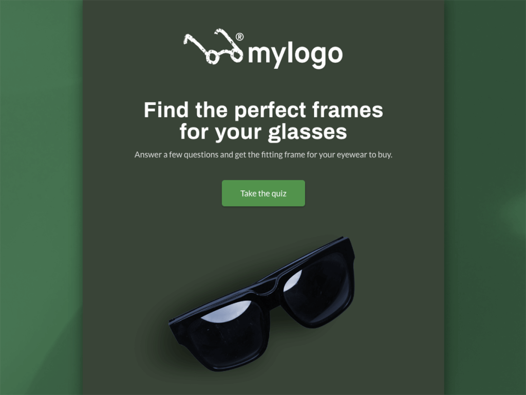
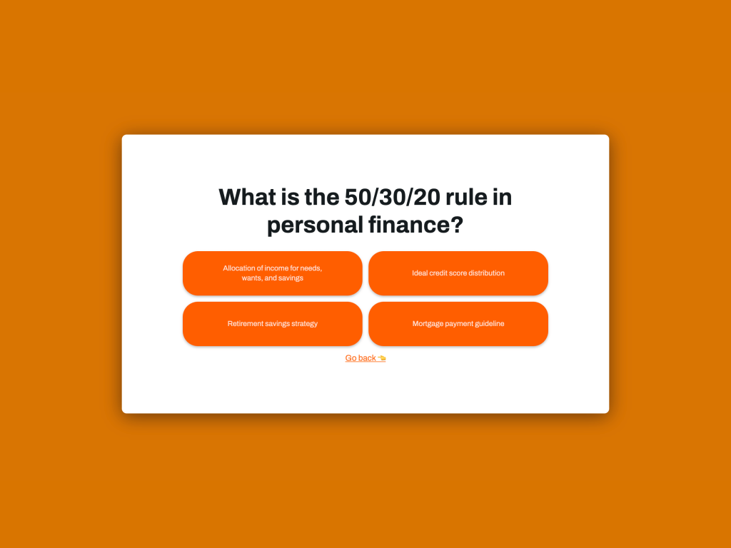
With a 96% completion rate, online quizzes are a powerful marketing funnel tool. They have high potential to attract leads and keep them engaged by bringing interactivity into play.
You can retain your eCommerce homepage visitors with different quiz types:
Knowledge quiz
Product finder
Product recommendation quiz
Shoppable quiz, etc.
Have a look at the product quiz by Persona Nutrition. It’s placed right in the above-the-fold area of the homepage and captures your attention immediately.

You can receive personal recommendations based on your goals at Vanna Belt as well.

Check some other examples of eCommerce quizzes to spark inspiration and go to involve.me’s quiz maker to test your ideas and see the results instantly on your site.
Create Your Own Quiz
Start with a template
Shoppable Video
Videos are quite popular interactive content marketing tactics among brands. They are used by as many as 94% of marketers.
You can make your video content shoppable and launch a video-powered sales funnel.
Check out these shoppable videos on the homepage of RIFRUF.

They helped the company increase customer engagement by 13% and conversions by 7%. As for the revenue, RIFRUF added $50,000+ in less than half a year with video shopping.
Survey
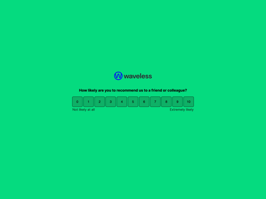
Often underrated and underutilized, surveys are pivotal for eCommerce businesses. They can help you boost the conversion rate of your eCommerce home page and establish a strong connection with your customers straight from your e-porch.
Ok, but what should I actually ask my customers?
Quite a natural thought may have crossed your mind.
Grab these survey questions designed specifically for eCommerce. Besides, let’s see some examples of how brands use surveys on their homepages.
Kennedy Blue, for example, uses a customer feedback survey on its homepage through a pop-up.

Another example. Here’s a short survey at Natural Farm Pet to unlock a discount:

involve.me can help you create a stunning survey with customizable design and personalized follow-up questions.
Create Your Own Survey
Start with a template
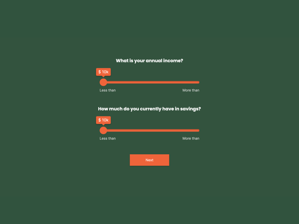
Calculator
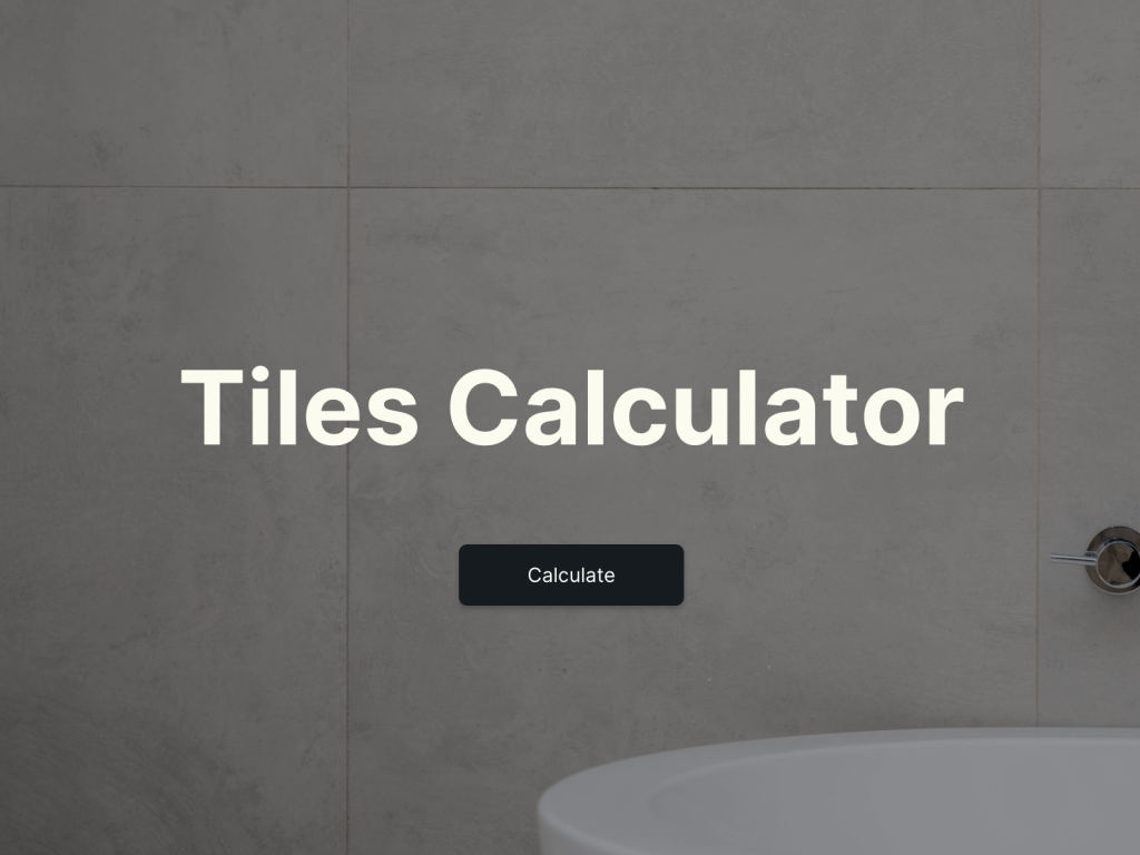
A calculator alone can supercharge the homepage of your eCommerce site. It helps capture high quality leads and boost user engagement.
52% of marketers prefer calculators as a form of interactive content to convert a passive website lurker into an active user or buyer.
The most popular eCommerce calculator templates are:
Price quote calculator
Shipping cost calculator
Discount calculator
ROI calculator
Financial planner calculator
Below is an example of a savings calculator offered by Billshark.

You can make your calculator right now and embed it easily on your homepage.
Instant Discount or Incentive
Four in five consumers say that a promotional offer from a new brand would encourage them to make a first-time purchase. According to the same study, 67% of online shoppers made a purchase they had not planned due to a discount or coupon.
Discounts, coupons, or other incentives can be ingrained into your e-store’s homepage. Look at this 20% discount at Argos below.

Alternatively, it may pop up just like this limited-time offer on the homepage of Busybabymat.

Stand-out CTA
A visible call-to-action (CTA) is one of the top landing page trends even now, and it’s here to stay.
Why? Because it works. Well-crafted CTAs can actually skyrocket your conversions by 80%.
Ryan Hammill, Co-Founder and Executive Director of the Ancient Language Institute, explains how to create calls-to-action that will stand out on your main page:
“When crafting CTAs, there are some fundamental things to consider: color, text, shape, and placement. Your CTA should be contrasting and highly impactful. Red, orange, green, and blue convert better than other colors. The best place for a CTA is above the fold, either at the center or at the top right corner.”
Look at the CTA buttons on the home page of The Ancient Language Institute. They are placed at the center and have good visibility.

As for the shape, it’s worth knowing that button-like CTAs can help achieve a 45% boost in clicks.
Now to the text. You may use the following words and phrases for your CTA buttons to increase conversions.
For Shopping:
Shop now
Order now
Start my free trial
Let me try it!
Download
For Email Subscriptions:
Sign up
Come on in!
Join the club
Yes, I want to learn more!
Subscribe now
For Collecting Feedback:
Write a review
Have your say
Leave your feedback
Take a survey
Tell us what you think
For Special Offers and Lead Magnets:
Grab it
Unlock your ___
Today is your day
Gimme!
Reveal My Code

Customer Reviews
If you peer into B2B eCommerce, for example, you’ll see that 68% of B2B buyers prefer to read reviews on the company’s website before making a decision to buy. Generally, 46% of customers trust online reviews as much as recommendations from family or friends.
“Customer reviews are great markers of your product/service value for first-timers,” says Eric Mills, Owner of Lightning Card Collection. He continues: “They add huge social proof, build brand credibility, and increase the likelihood of a purchase. Your homepage should display customer testimonials up front. You can mention a new review each week in the header, for example. As an alternative, reviews may be embedded below the fold on your homepage.”
Lightning Card Collection displays a carousel of reviews from parents who bought Pokemon cards for their kids.

Here’s how Butternut Box showcases customer feedback from #Butternutters collected on social media.

3 Bonus Tips for Ecommerce Homepages With a Wow Effect
Tastes differ. However, you can’t deny that the following e-shops nailed their homepages. You can do that too. Follow some additional tips below.
Catch the Branding Vibe
What does this mean, you ask?
You’ll understand it, once you open the homepage of Death Wish Coffee and get swept from your feet by the exquisite noir wave. The brand also grabs your attention with the bold and highly-visible USP written in white letters on the dark background: Meet the other side of ordinary.

Scroll through some new design trends and let your homepage fit the look-and-feel of your brand perfectly well.
Don’t forget about your interactive forms or popups that should emphasize your brand’s theme as much as possible, too. For example, Alvar Pet addressed the tiniest details in homepage design and created a cookie consent popup with Woof woof! We use cookies and dog’s paw prints.

Create an Animated Web Header
Of course, you can go with a static header image for your home page.
But why not immerse your visitor completely into your eCommerce store with high-quality animation?
Berlin Packaging, for instance, makes your mouth fall open on its Romanian homepage version. It brings B2B content marketing to the next level with an immersive video-header.

Btw, it’s a perfect example of geographic customer segmentation. Once you switch your location to the United States, you see a completely different homepage.

Let Influencers Do the Job for You
Influencer marketing is expanding greatly. It’s already one of the top marketing trends that will be shaping eCommerce in 2023 and beyond.
Jockey, for example, partnered with Luke Brian, an American country singer. The company launched its Outdoors Collection with their new brand ambassador and featured it in the above-the-fold.

Start Improving Your Ecommerce Home Page
A well-designed homepage of your eCommerce site can significantly improve the shopping experience, boost the conversion rate, and guarantee successful sales.
This article has given you all the information and tools to structure and optimize it for better performance.
With involve.me, your home page is in the best of hands. No time to lose – register now and amaze your customers with interactive content every day.

